
Forgot one yesterday. Something to think about,.....Originally Posted by S Landreth

There are diseases hidden in the ice, and they are waking up.
Long-dormant bacteria and viruses, trapped in ice and permafrost for centuries, are reviving as Earth's climate warms
Throughout history, humans have existed side-by-side with bacteria and viruses. From the bubonic plague to smallpox, we have evolved to resist them, and in response they have developed new ways of infecting us.
We have had antibiotics for almost a century, ever since Alexander Fleming discovered penicillin. In response, bacteria have responded by evolving antibiotic resistance. The battle is endless: because we spend so much time with pathogens, we sometimes develop a kind of natural stalemate.
However, what would happen if we were suddenly exposed to deadly bacteria and viruses that have been absent for thousands of years, or that we have never met before?
We may be about to find out. Climate change is melting permafrost soils that have been frozen for thousands of years, and as the soils melt they are releasing ancient viruses and bacteria that, having lain dormant, are springing back to life.
In August 2016, in a remote corner of Siberian tundra called the Yamal Peninsula in the Arctic Circle, a 12-year-old boy died and at least twenty people were hospitalised after being infected by anthrax.
The theory is that, over 75 years ago, a reindeer infected with anthrax died and its frozen carcass became trapped under a layer of frozen soil, known as permafrost. There it stayed until a heatwave in the summer of 2016, when the permafrost thawed.
This exposed the reindeer corpse and released infectious anthrax into nearby water and soil, and then into the food supply. More than 2,000 reindeer grazing nearby became infected, which then led to the small number of human cases.
The fear is that this will not be an isolated case.

Results 4,701 to 4,725 of 6858
Thread: Any doubts about Climate Change?
-
19-05-2017, 02:25 PM #4701Guest Member


- Join Date
- Sep 2008
- Last Online
- @
- Location
- left of center
- Posts
- 25,212
Keep your friends close and your enemies closer.
-
19-05-2017, 06:35 PM #4702Molecular Mixup


- Join Date
- Aug 2010
- Last Online
- 09-06-2019 @ 01:29 AM
- Location
- 54°N
- Posts
- 11,334
Fake news Article

Climate change is turning Antarctica green, say researchers
https://www.theguardian.com/science/...ay-reseatchers
Antarctica may conjure up an image of a pristine white landscape, but researchers say climate change is turning the continent green.
Scientists studying banks of moss in Antarctica have found that the quantity of moss, and the rate of plant growth, has shot up in the past 50 years, suggesting the continent may have a verdant future.

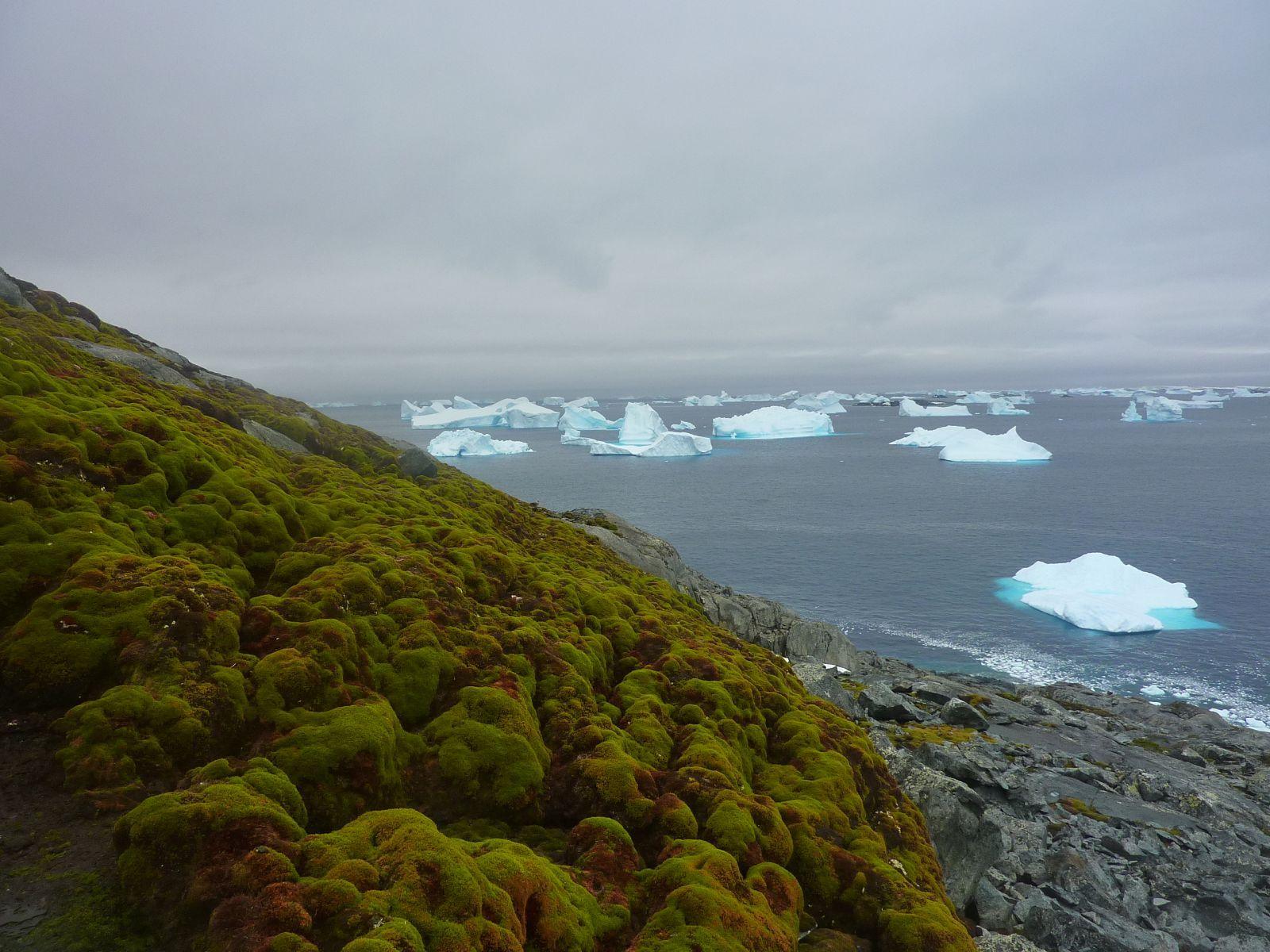
Real headline should read
Antarctica might go green say scientists (only 2km of ice and 50C of warming to go)
More great journalism from The Guardian:
Climate change is turning Antarctica green, say researchers Or maybe it isnt.
Check out the brave actual prediction:
Antarctica is not going to become entirely green, but it will become more green than it currently is, said Matt Amesbury, co-author of the research from the University of Exeter.
Antarctica might go green say scientists (only 2km of ice and 50C of warming to go) « JoNova
So some bits of moss are growing on some corners of Antarctica. Should we thank the blob of superheated magma lying underneath?
-
03-06-2017, 03:37 AM #4703Guest Member
- Join Date
- Sep 2008
- Last Online
- @
- Location
- left of center
- Posts
- 25,212
May 2017 Lower Troposphere - from the science denier Roy Spencer
The Version 6.0 global average lower tropospheric temperature (LT) anomaly for May, 2017 was +0.45 deg. C, up from the April, 2017 value of +0.27 deg. C
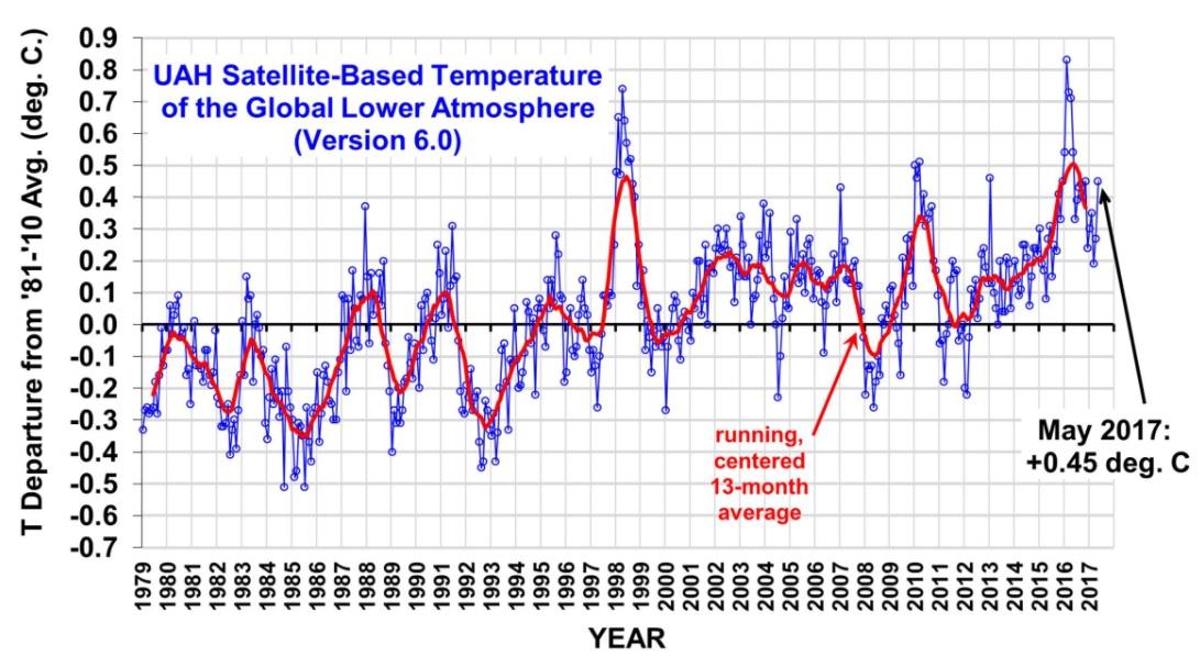
Looks like the second warmest May recorded (May 2016 was at 0.54)
__________
From RSS - Lower Troposphere (May 2017 not included)

___________
They are a bit late (HadCRUT4) to post with my JMA, NOAA, NASA and Copernicus monthly information but I will start including The MET Office results each month when I post the lower troposhere information in the future.
For now, The MET Office – April 2017, second hottest recorded.

____________
Arctic Sea Ice Volume

-
03-06-2017, 12:02 PM #4704Thailand Expat


- Join Date
- Feb 2009
- Last Online
- @
- Location
- Bali
- Posts
- 11,678
Melting glaciers also release methane gas formerly trapped below semi permanent ice sheets.
Apologies if this has already been covered, been away a lot.
-
03-06-2017, 01:42 PM #4705Thailand Expat

- Join Date
- Nov 2008
- Last Online
- Today @ 12:07 PM
- Location
- Berlin Germany
- Posts
- 7,251
I think methane is more of a concern for melting permafrost, mostly in Siberia but I guess in Alaska too. I am not too sure how severe this is. Methane is a much more powerful greenhouse gas than CO2 but it gets absorbed into the biosphere much faster. It does not linger as long in the air. Originally Posted by chassamui
"don't attribute to malice what can be adequately explained by incompetence"
-
03-06-2017, 02:59 PM #4706Thailand Expat

- Join Date
- Aug 2014
- Last Online
- 26-09-2021 @ 10:28 PM
- Posts
- 10,105
Putin on Paris climate change agreement: Dont worry, be happy
Russian President Vladimir Putin has called for calm in the wake of Donald Trumps decision to pull the US out of the Paris Agreement, joking that any bad weather encountered around the globe could now be blamed on American imperialism.
Speaking at the St. Petersburg International Economic Forum (SPIEF), the Russian president said the panic surrounding Trumps decision has been blown way out of proportion, noting that there is still time before the agreement, which was signed in 2015, goes into effect.
"Don't worry, be happy," Putin said in English.
Its about preventing temperature changes of two degrees, he reminded the audience, noting that we here [at the forum] somehow do not yet feel that the temperature is rising.
By the way, we should be grateful to President Trump. In Moscow its raining and cold and even, they say, some snow. Now we could blame this all on American imperialism, that its all their fault. But we wont.
https://www.rt.com/news/390612-dont-...limate-change/
-
03-06-2017, 03:14 PM #4707Harbinger of Doom
- Join Date
- Apr 2015
- Last Online
- @
- Posts
- 1,622
The short-term worry is methane release from decomposition of melting permafrost but a more long-term worry is destablization of oceanic hydrates. Atmospheric concentrations of methane were level for some time but in the last decade or so, they've been increasing again. There's certainly been an increase in Siberian off-gassing - the East Siberian Arctic Shelf is a real problem area because there's an absolute shitload of carbon there ready to go and it's very shallow and therefore highly at risk of warming. I think at the moment, this is somewhat minor but this is certainly going to be a major source of greenhouse gases, and it's one we will likely lose control of. Originally Posted by Takeovers
-
03-06-2017, 07:02 PM #4708Thailand Expat

- Join Date
- Sep 2009
- Last Online
- @
- Posts
- 102,027
No he definitely said "Don't whirry, Be hhheppy". Originally Posted by Klondyke
Which he probably is because he's doing his tits with the oil price at the current level.
-
03-06-2017, 11:12 PM #4709Thailand Expat
- Join Date
- Nov 2008
- Last Online
- Today @ 12:07 PM
- Location
- Berlin Germany
- Posts
- 7,251
I refuse to even think of that. If that methane hydrate shelf becomes unstable and is released suddenly it could become an Extinction Level Event. I guess humanity would survive as stone age tribes. Originally Posted by Passing Through
-
08-06-2017, 03:23 AM #4710Thailand Expat
- Join Date
- May 2008
- Last Online
- 01-05-2022 @ 06:28 AM
- Location
- NAKON SAWAN
- Posts
- 5,674
https://m.youtube.com/watch?feature=share&v=iEPW_P7GVB8
Sorry I forgot to take off the s
-
08-06-2017, 05:05 AM #4711Guest Member
- Join Date
- Sep 2008
- Last Online
- @
- Location
- left of center
- Posts
- 25,212
Still no science dippy? Originally Posted by RPETER65
Climate Denier - Ian Plimer (the person in dippys video)
July, 2009
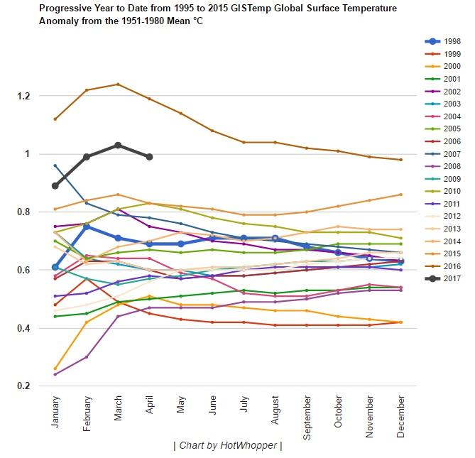
There is no problem with global warming. It stopped in 1998. The last two years of global cooling have erased nearly 30 years of temperature increase.
___________
2009
Ian Plimer Published Heaven and Earth. The book asserts that the temperature changes we have observed in the 20th century are within the normal range of variability, that significant global warming is not happening and that there is negligible human impact on warming.
___________
Five years ago British engineer Alan Rudge and Australian geologist Ian Plimer both members of the GWPF academic advisory council bet Hope £1,000 each that the Earth would be cooling by now, not warming.
Hope bet that average global temperatures in 2015 would be no more than 0.1°C cooler than in 2008.
As data released by the UK Met Office on 20 January revealed, the average global temperature in 2015 was 0.75°C higher than the long-term average between 1961 and 1990. The Met Office expects 2016 to beat this record.
When compared with the pre-industrial period, the 2015 average global temperature was around 1°C above the long-term average from 1850 to 1900 the Met Office said.
Temperature data from NASA and the National Oceanic and Atmospheric Administration (NOAA) also showed that 2015 surface temperatures were the warmest since modern record keeping began in 1880.
correction: 3rd warmest May (1998 was also warmer at .64) Originally Posted by S Landreth
-
08-06-2017, 06:49 AM #4712Thailand Expat
- Join Date
- May 2008
- Last Online
- 01-05-2022 @ 06:28 AM
- Location
- NAKON SAWAN
- Posts
- 5,674
Originally Posted by S Landreth
Sorry dippy but geology is science and this science has a lot to say about the variations in the global climate.
-
08-06-2017, 06:54 AM #4713Heading down to Dino's

- Join Date
- Jun 2009
- Last Online
- @
- Posts
- 31,739
No it doesn't and it has been debunked. Ian Plimer is a shill for the mining industry; Originally Posted by RPETER65
Another fail by repeter666.Plimer has been a director of numerous mining companies including Ivanhoe Australia, a subsidiary of Bob Friedland's Ivanhoe Mines, CBH Resources, Kefi Minerals, Silver City Minerals, Ormil Energy Ltd, TNT Mines, Niuminco Group and Lakes Oil.
-
08-06-2017, 08:29 PM #4714Thailand Expat
- Join Date
- May 2008
- Last Online
- 01-05-2022 @ 06:28 AM
- Location
- NAKON SAWAN
- Posts
- 5,674
Originally Posted by bsnub
There is no fail here,if you think geology is not a science that plays a large role in the investigation into the cause of climate changes over the history of the earth you are a moron. Get away from your liberal news sources,of which you don't seem to care to share, and come on into the real world.
So you think you can discredit the work of a scientist by posting who there employer is,I think not as everybody works for somebody and the climate science alarmist are working for a very liberal govt. intent on supporting a large scale wealth redistribution scheme.Last edited by RPETER65; 09-06-2017 at 02:46 AM.
-
09-06-2017, 05:34 AM #4715Heading down to Dino's
- Join Date
- Jun 2009
- Last Online
- @
- Posts
- 31,739
^ You really are a blathering idiot. The man is pushing junk discredited garbage. Have you ever hear of conflict of interest? Working for the oil and gas or mining industries is a major red flag you idiot. Those industries have been tying to discredit climate change for decades and this clown happens to be the director of several mining companies. He stands to benefit financially by discrediting climate change.
What would you suggest Brietbart or maybe the gateway pundit? Originally Posted by RPETER65
 Fcuking lemming.
-
09-06-2017, 07:42 AM #4716Thailand Expat
- Join Date
- Feb 2009
- Last Online
- @
- Location
- Bali
- Posts
- 11,678
I find it amusing that some people, even alleged scientists, debate that climate change is not happening.
Outside the natural cyclic events recorded through history, there are changes taking place. The reason it is a problem is quite simple. Firstly there can be no doubt that whatever cyclic natural changes are taking place, anthropomorphic changes are a major contributory factor. Secondly, due in no small part to human behaviour, the pace of these changes and the subsequent feedback loops it creates are accelerating the pace of natural cyclic changes.
The net result is, and will continue to be, an adverse effect on the ability of man and natural processes to adapt to such rapid changes. (Adaptation is the only possible way to ameliorate these effects).
Anyone suggesting otherwise is a moron, or a paid lobbyist.Heart of Gold and a Knob of butter.
-
09-06-2017, 09:01 PM #4717Thailand Expat
- Join Date
- May 2008
- Last Online
- 01-05-2022 @ 06:28 AM
- Location
- NAKON SAWAN
- Posts
- 5,674
Originally Posted by bsnub
You are making my point for me, no matter who you work for there is money and working for the progressives in support of man caused climate change is very lucrative.The real objective of these progressives is a huge scheme of wealth redistribution in the world.
The other thing hear is can you show proof that the science of geology doesn't shed light on the cause of a changing global climate. Can you show irrefutable proof the points made in the video are not fact.
By the way, still waiting for you to reveal your news sources.
Not suggesting any particular news source but a mix of conservative and liberal and then,if your able, use some critical thinking to come to an intelligent conclusion.Last edited by RPETER65; 09-06-2017 at 09:06 PM.
-
09-06-2017, 10:06 PM #4718Thailand Expat
- Join Date
- Feb 2009
- Last Online
- @
- Location
- Bali
- Posts
- 11,678
RJP It does not mean that, just because you can't understand it, it isn't happening exactly as I described it.
Ae you a moron or a lobbyist?
-
17-06-2017, 04:24 AM #4719Thailand Expat
- Join Date
- Sep 2008
- Last Online
- 03-02-2025 @ 09:57 AM
- Posts
- 4,387
I finally had a chance to look into this link and I found the 97% consensus claim is propaganda, its a conflation of those believing in MMCC and those who think it will lead to disastrous consequences. Originally Posted by harrybarracuda
A 2013 study by Andrew Montford of the Global Warming Policy Foundation found that Cook had to cast a wide net to cram scientists into his so-called consensus. To be part of Cooks consensus, a scientific study only needed to agree carbon dioxide is a greenhouse gas and that human activities have warmed the planet to some unspecified extent both of which are uncontroversial points.The extent to which the warming in the last two decades of the twentieth century was man-made and the likely extent of any future warming remain highly contentious scientific issues.So the consensus for catastrophic man-made climate change is less than 1%.A paper by five leading climatologists published in the journal Science and Education found only 41 out of the 11,944 published climate studies examined in Cooks study explicitly stated mankind has caused most of the warming since 1950 meaning the actual consensus is 0.3 percent.
Top MIT Climate Scientist Trashes ?97% Consensus? Claim | The Daily Caller
-
17-06-2017, 05:37 AM #4720Thailand Expat
- Join Date
- Sep 2009
- Last Online
- @
- Posts
- 102,027
More bollocks funded by the fossil fuel industry.
Little surprise that an idiot like you swallowed it.
-
17-06-2017, 05:46 AM #4721R.I.P.

- Join Date
- Dec 2006
- Last Online
- @
- Location
- ALL GLORY TO THE HYPNOTOAD
- Posts
- 17,118
Jesus! I hadn't realised there were still people who didn't understand about climate change. Do they also believe in witchcraft and Prince Charles' ability to cure scrofula? Thankfully their genetic line will soon die out as they don't believe in vaccination either.
-
17-06-2017, 06:28 AM #4722Molecular Mixup
- Join Date
- Aug 2010
- Last Online
- 09-06-2019 @ 01:29 AM
- Location
- 54°N
- Posts
- 11,334
We OVERSTAND the issue Bob..
And
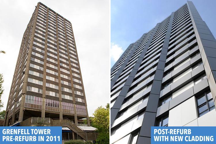
The fire in London was caused by Man Made Global Warming nutters at Kensington council, trying to get in the EU's good books by wrapping the buildings up..
to make it become a Zero-Energy Building...
That Grenfell tower with its lovely 1970's naked concrete never stood a chance..
-
17-06-2017, 08:21 AM #4723Thailand Expat
- Join Date
- May 2008
- Last Online
- 01-05-2022 @ 06:28 AM
- Location
- NAKON SAWAN
- Posts
- 5,674
Proof? Originally Posted by harrybarracuda
-
17-06-2017, 08:48 PM #4724Thailand Expat
- Join Date
- Sep 2009
- Last Online
- @
- Posts
- 102,027
Throughout this thread every time you or another idiot posts big oil propaganda. Try reading it. Originally Posted by RPETER65
-
18-06-2017, 12:18 AM #4725Thailand Expat
- Join Date
- Sep 2008
- Last Online
- 03-02-2025 @ 09:57 AM
- Posts
- 4,387
No rebuttal then. Ok.


 Reply With Quote
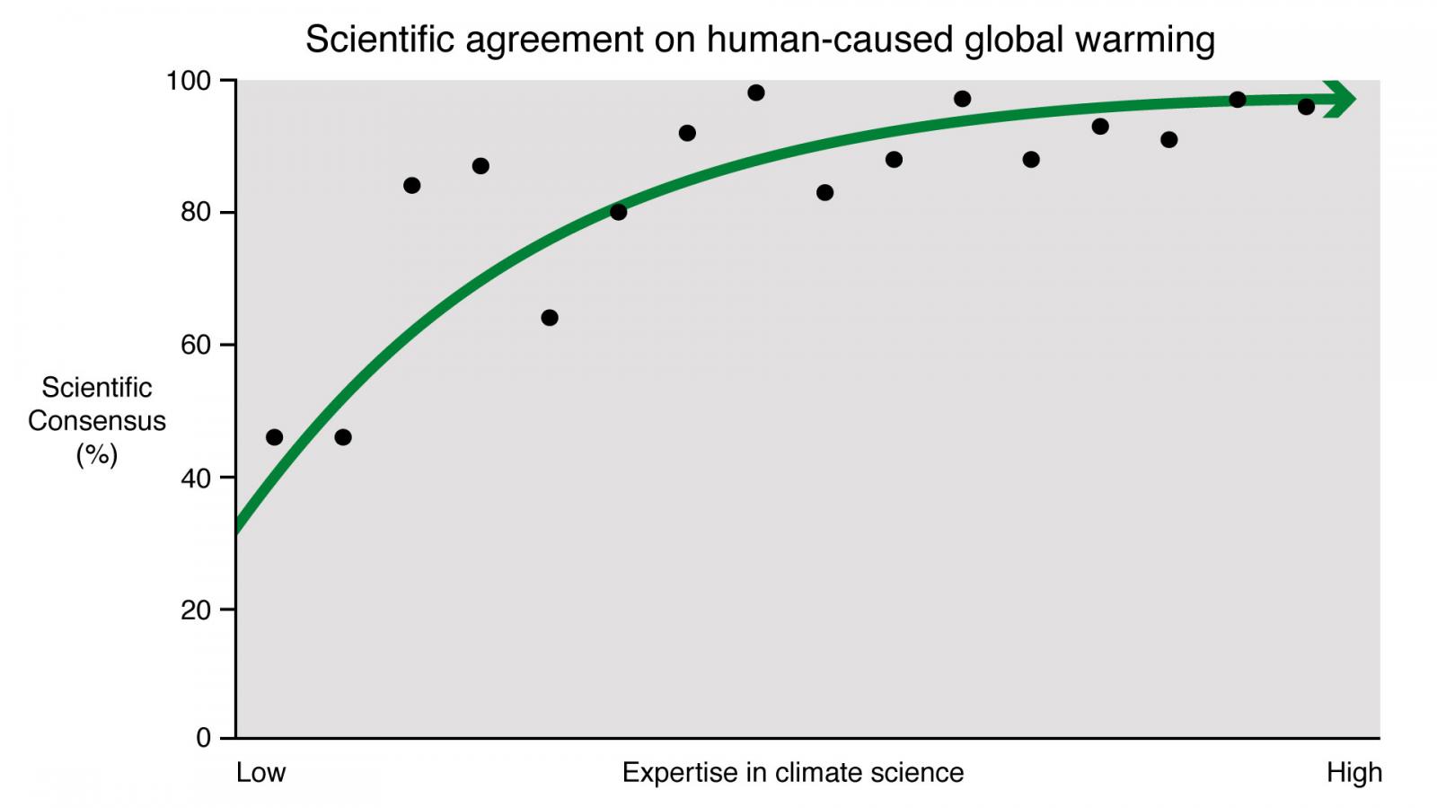
Thread Information
Users Browsing this Thread
There are currently 3 users browsing this thread. (0 members and 3 guests)
