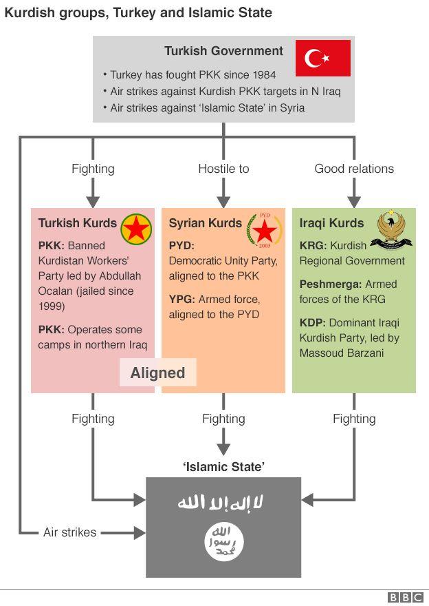
Do you have a similar graphic where the crusader coalition members also plug in and show which groups they are supporting or slaughtering, allegedly. Maybe some variations indicating when one supporter switched to slaughter mode.
Maybe a better graphic would be one showing which country has been there the longest, which country has spent the most money or which one has lost the most lives there. Break them down into say decades from the 18th century.
Results 1 to 25 of 3611
Threaded View
-
15-02-2016, 04:36 PM #11Thailand Expat


- Join Date
- Jul 2010
- Last Online
- 24-07-2024 @ 09:54 PM
- Location
- Where troubles melt like lemon drops
- Posts
- 25,350
Thread Information
Users Browsing this Thread
There are currently 1 users browsing this thread. (0 members and 1 guests)


 Reply With Quote